De La Cruz Rebrand
This rebrand came about a cat-sitting visit. Kisha was taking care of Olive, my roommates' cat, and while we were talking, Kisha brought up ‘De La Cruz’- her lingerie small business to which I replied: “I am a graphic designer; let me do your rebrand”. She said yes.
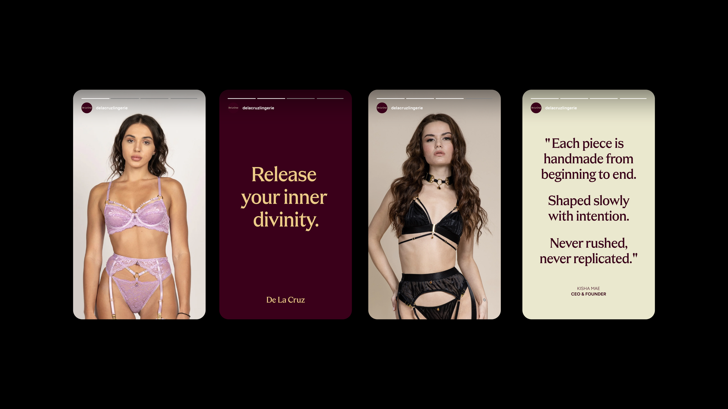
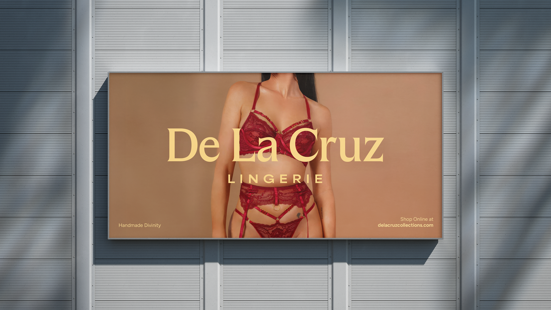
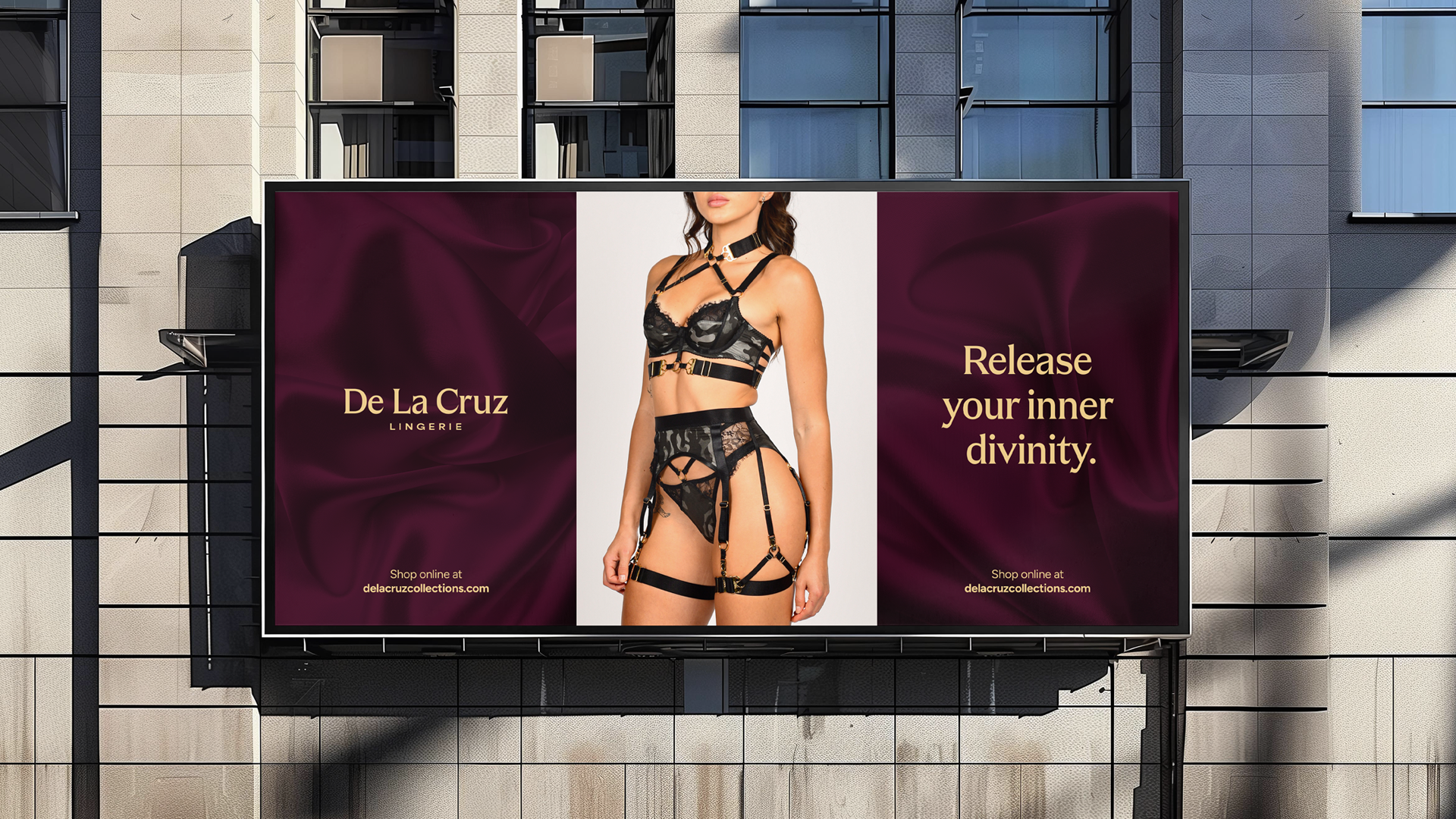
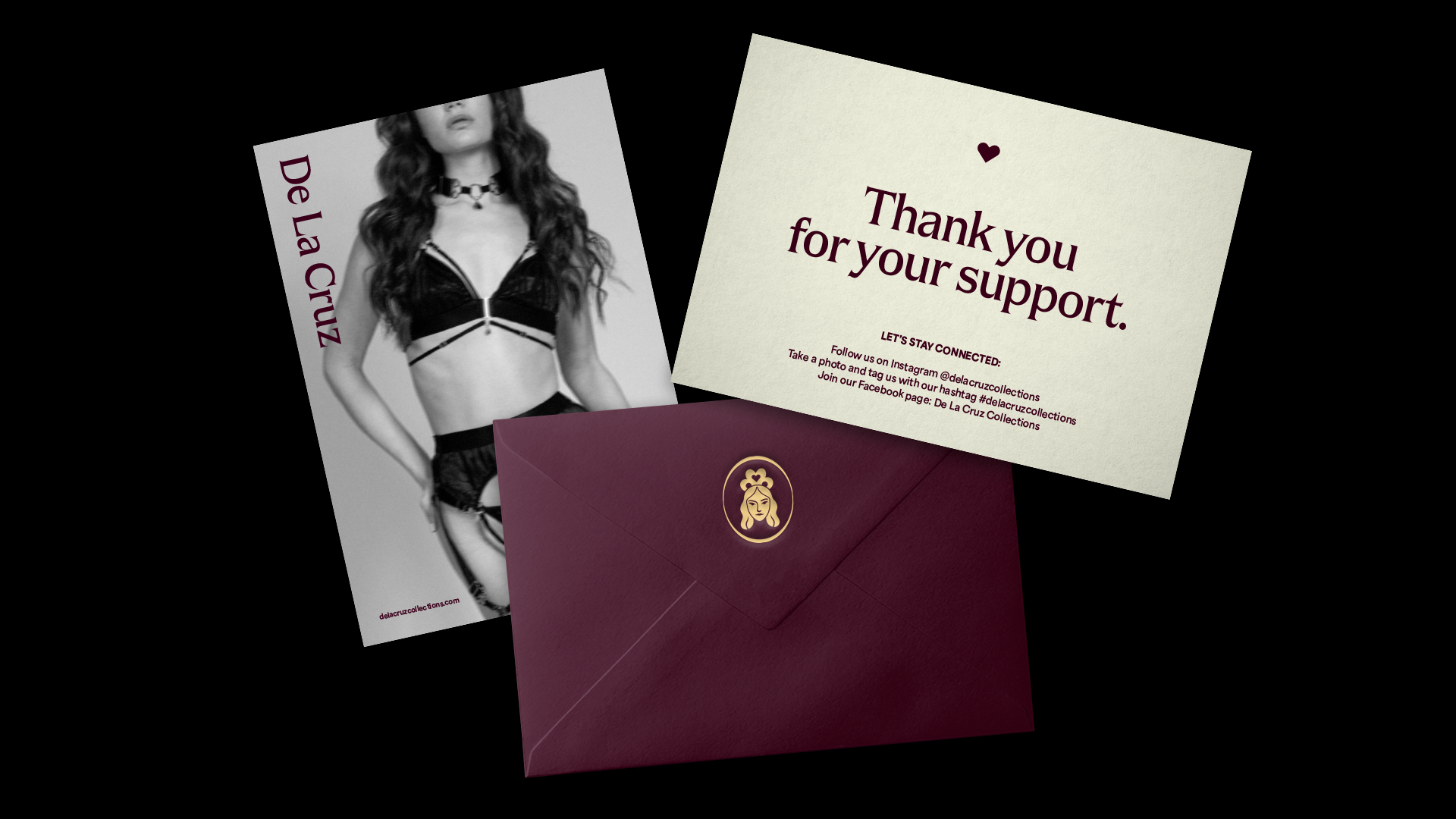
Kisha’s vision for her brand was a bolder, more confident yet alluring identity. I suggested adding some kind of accent color to contrast from her original gold-and-black palette. Additionally, I was adamant about introducing a non-public typeface that would help her stand out from the crowd and resonate with the brand values she had in mind.
The result is a minimal, somewhat familiar ‘De La Cruz’ that is polished and recognizable. This rebrand is Kisha’s foundation to keep growing her brand.
Length
5 months
Tools
Illustrator, Photoshop, Reve Ai
Project
Rebrand

I suggested Kisha to change her sub-header to ‘Lingerie’ as it would help with her search engine optimizations and brand description.
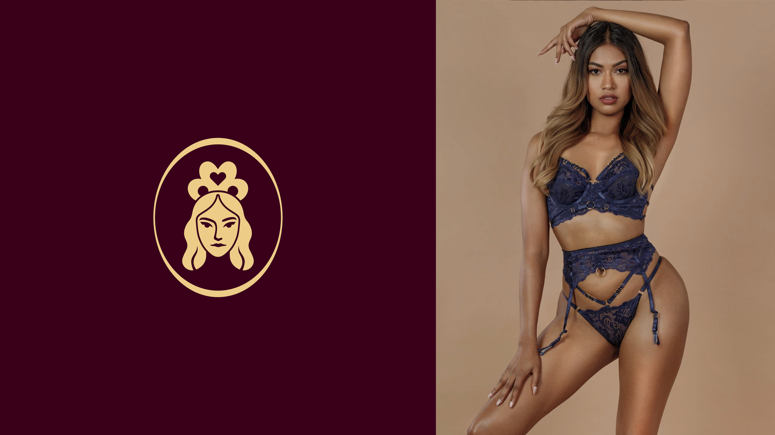
In our intial talks I introduced the idea of a muse to Kisha. An unamed figure that would act as an icon emblem for the brand appearing in smaller applications adding more depth to the brand as a whole.

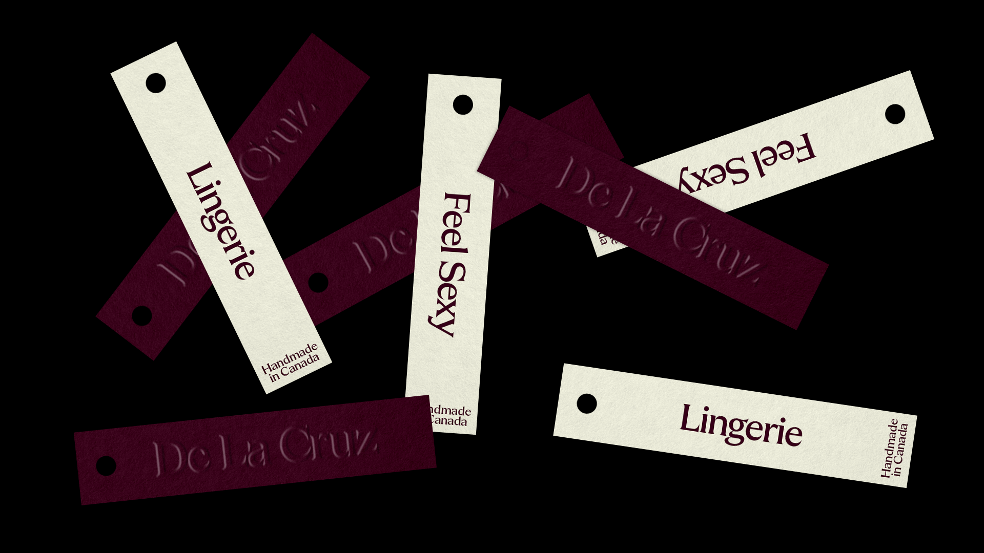
A strong selling point I found in Kisha’s brand was the fact that she makes each piece by hand and that she is based in Canada. I thought about where was the best place to include that and landed in the tags as a small detail to find out for a purchaser.
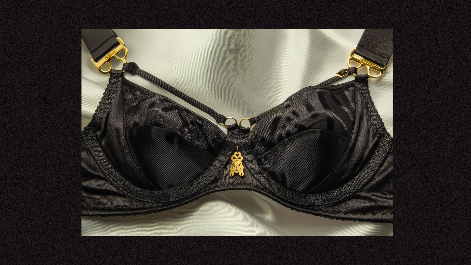
This image was created using Artificial Intelligence