Photo credit: Instagram @dahandialedin
Jadedchristina Logo
DJ and friend of mine @jadedchristina wanted a logo for her new journey behind the decks. We talked about the hazy vibes inside clubs and the importance of keeping her compound name as one word. The options I presented kept tight kerning to allude to the blurry feeling in those dark spaces, as well as having an element of contrast that would differentiate ‘jaded’ from ‘christina’ while keeping it together.
Pressure Profile Thumbnail Design
DJ and friend of mine, @chumb_b0, wanted a thumbnail design for his radio show on FSR - @fsr.live.
Inspired by the music Chumbo plays at his cafe during closing time, Chumbo approached me with the name “Pressure Profile,” which refers to a technical aspect of making an espresso. The inclusion of a pressure gauge was a must, so a fu,n gritty image treatment was the way to go ☕️
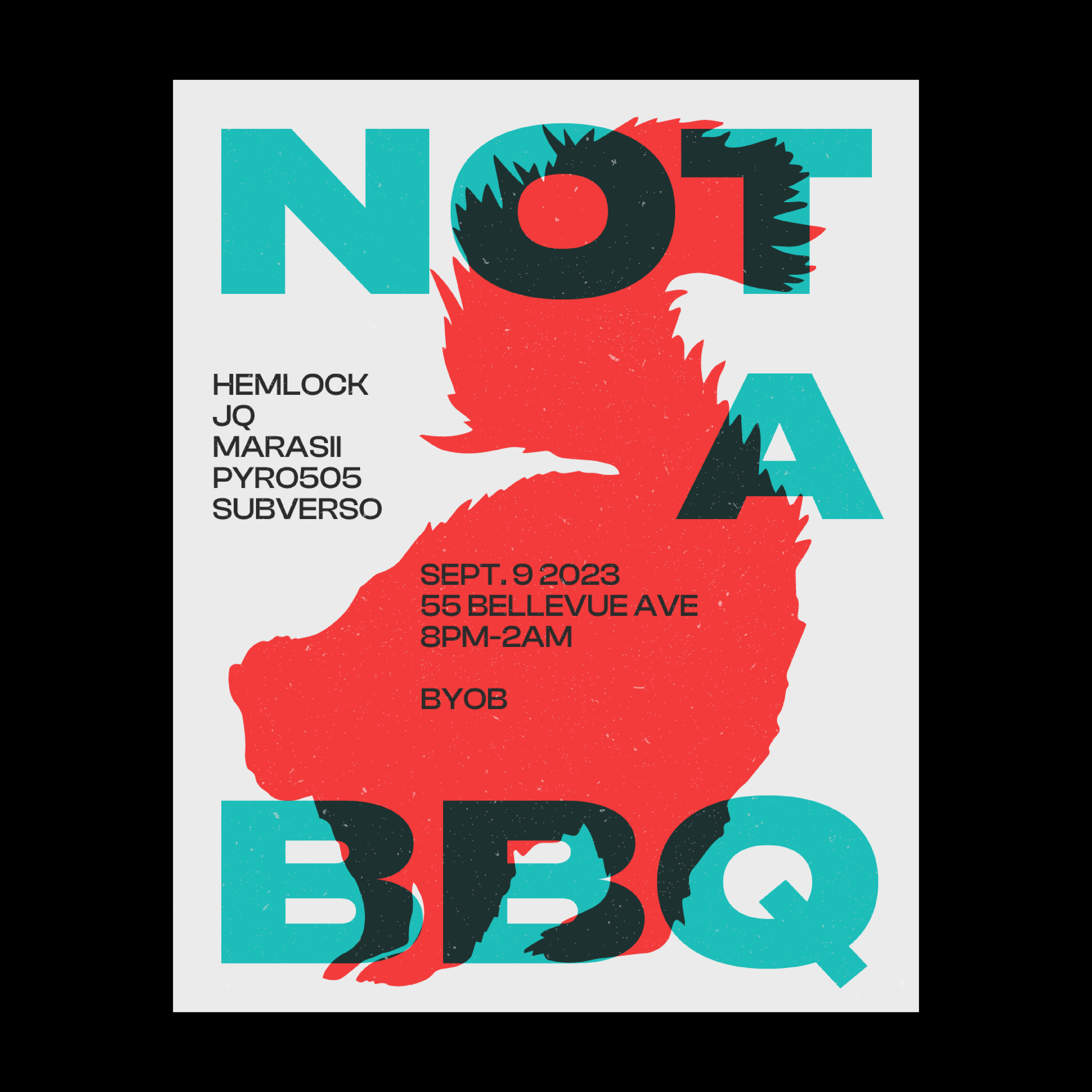
Not A BBQ Poster
Archivo Latino
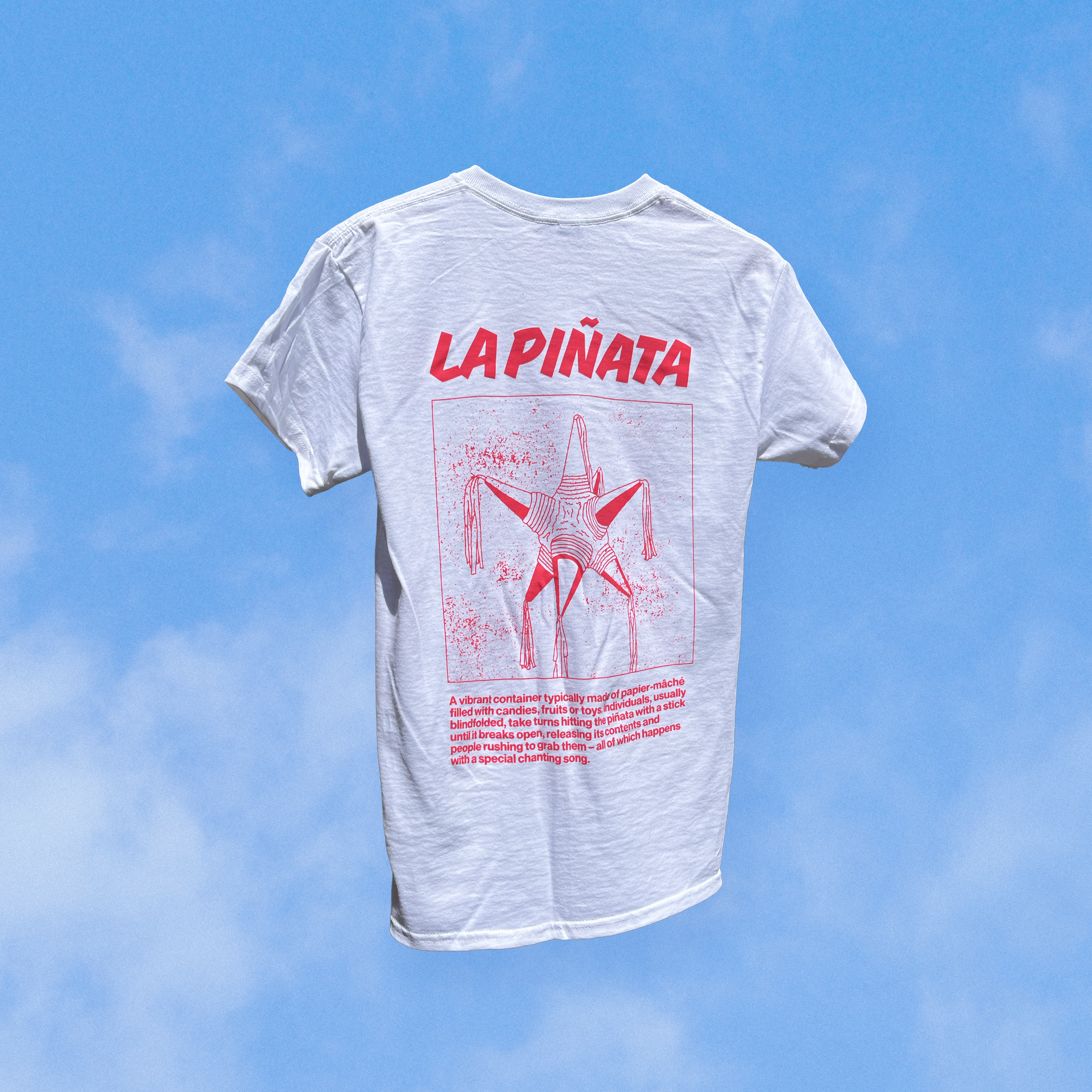
Archivo Latino is a t-shirt print project celebrating Latin American culture by showcasing culturally relevant objects brought upon a series of interviews with members of Project Crea, an initiative by Creato. The word ‘archivo’ in Spanish stands for ‘archive’ and so this project intends to capture a collection of objects in the form of a walking museum, informing viewers about the objects' meanings and origins through a Latin American context.
Typeface Credits:
| Alebrejie set in Basteleur from Velvetyne by Keussel
| Lapis Lazuli set in Resistance from Velvetyne by a collective of students at La Générale Paris
| Piñata set in Sharpie from Indian Type Foundry by Théo Guillard
| Olleta y Molinillo set in Ouroboros from Velvetyne by Ariel Martín Pérez


Archivo Latino – Exhibition
Archivo Latino was shown in a live-person event at the end of the mentorship program of Project Crea. My intention with this installation was to capture the feeling of a Tianguis; a traditional open-air market in Mexico and Central America. Milk crates are often used as seating for the merchants or cubbies to store merchandise. Since these markets are always under 10 x 10 ft tarps, merchants maximize their displays by hanging them; my twist was to create a symmetrical composition that would be pleasing to the eye and would allude to the hanging displays of Tianguis merchandise.
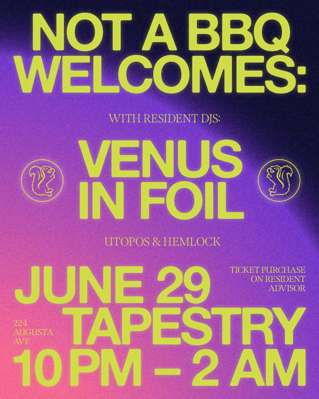
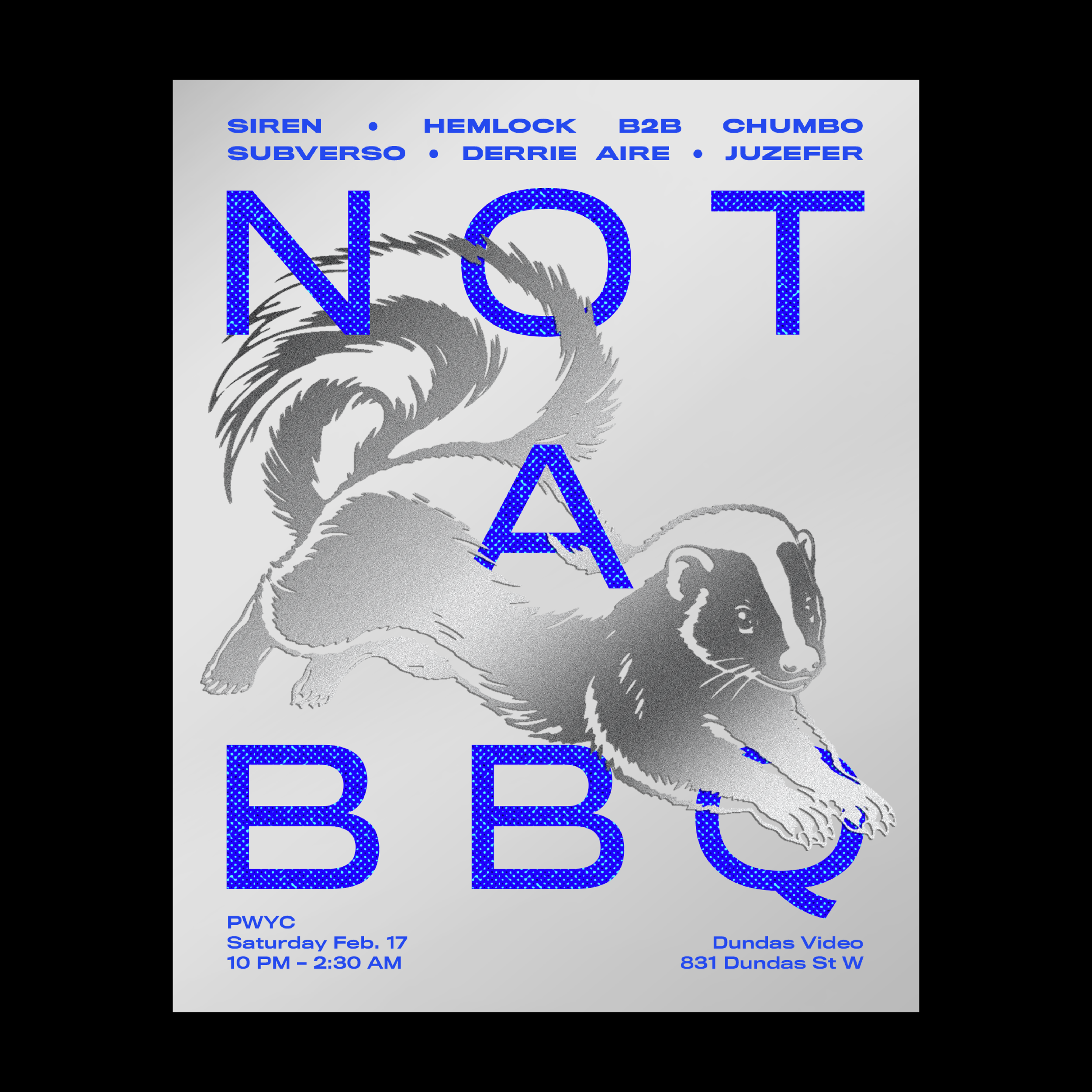
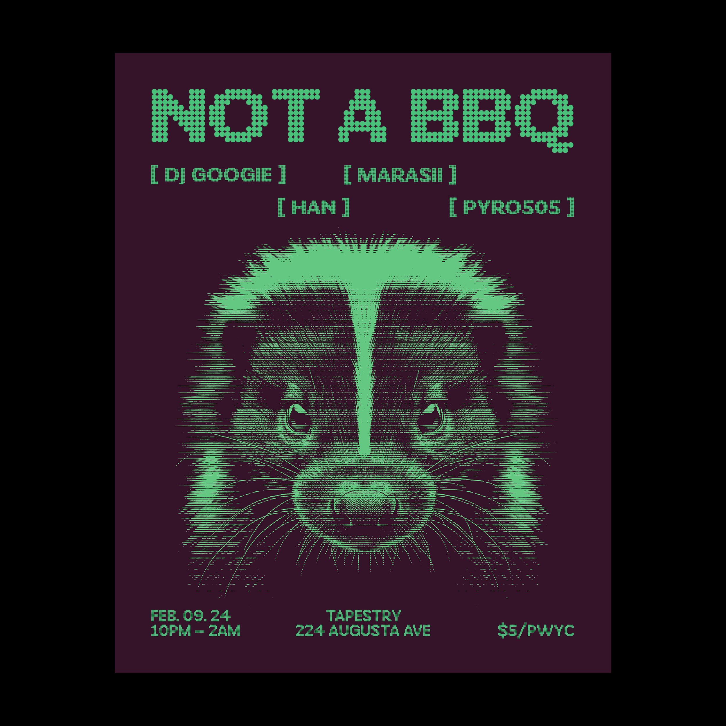
NOT A BBQ Posters
Last summer a friend of mine started hosting BBQs in his backyard. These BBQs started including electronic music and friends DJing until the early hours of the morning. The joke was that my friend started telling people there would be NO FOOD in the following gatherings, and so these gatherings were then called NOT A BBQ – @notabbq was born. My friend then created the first invite poster for NOT A BBQ featuring a skunk. He then requested me to do the following posters since then and adopted the skunk as our mascot.
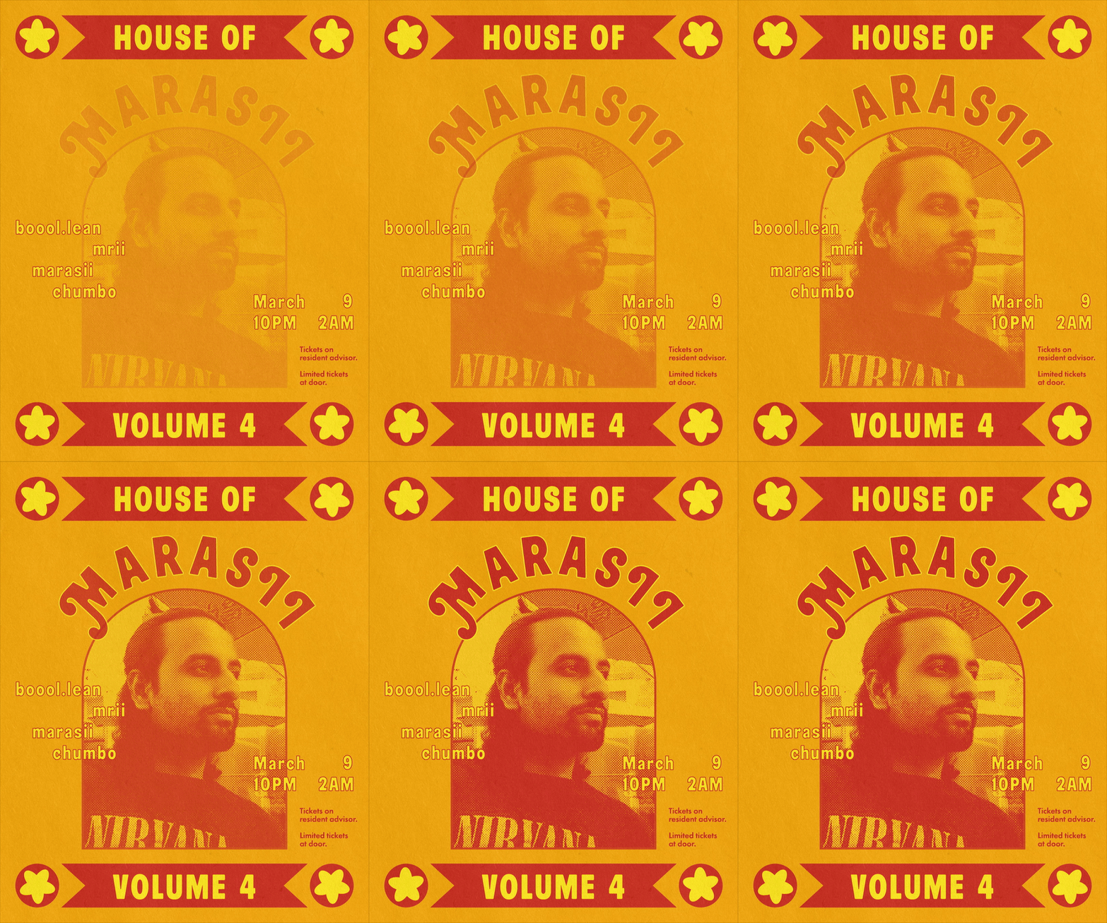
House Of Marasii Poster
Thanks to the exposure of the NOT A BBQ Posters I was able to create yet another poster for another series of DJ sets. Here’s the first iteration of House of Marasii – where Marasii the main DJ invites his friends to DJ or play live music with a focus on desi sounds.
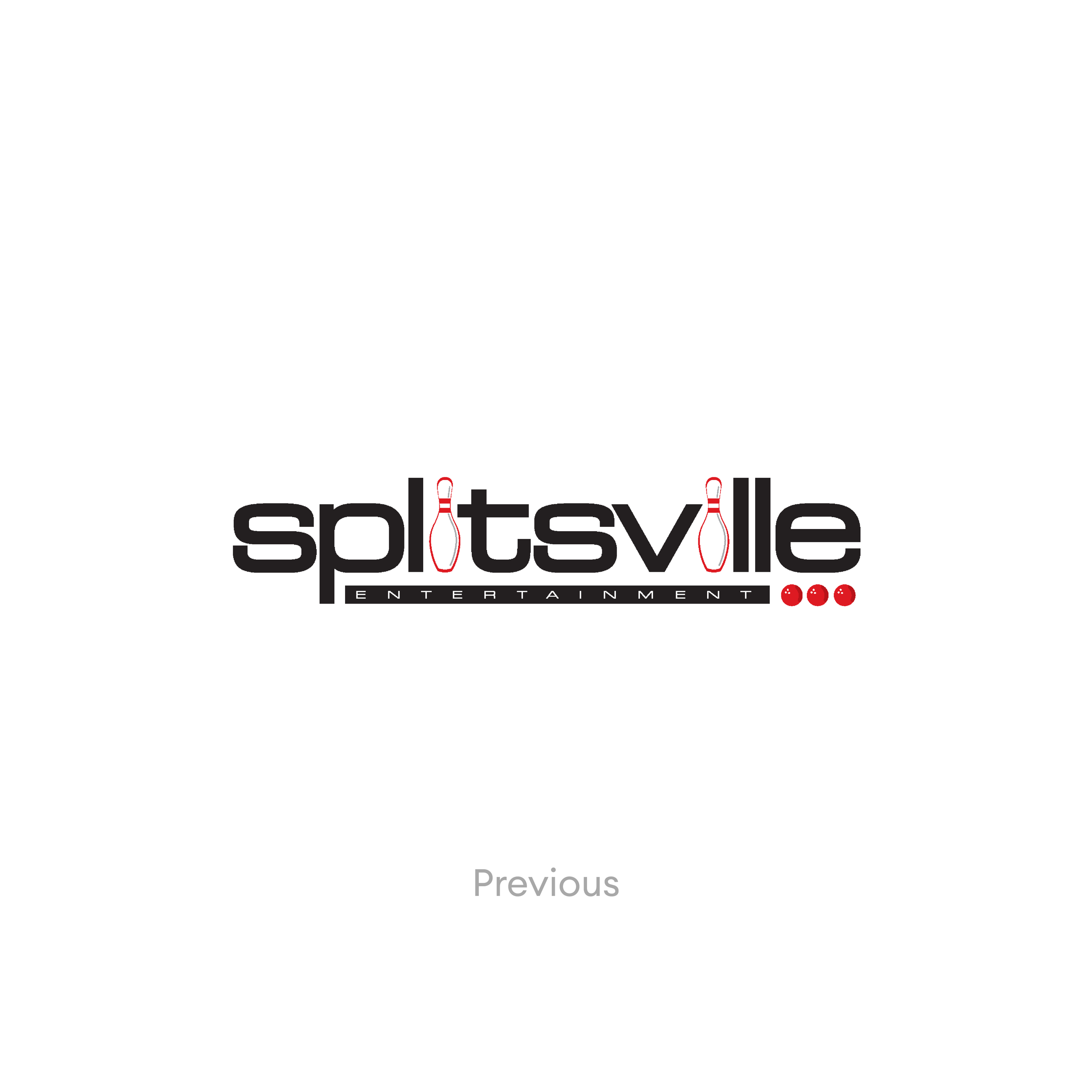
Splitsville’s Logo
While working in Zerotrillion I got the opportunity to re-imagine Splitsville’s branding– a chain of bollowing alleys in Canada. We presented various options and ultimately landed on one that alluded to the old logo, with a fresh take. The new logo retained the iconic “i” pin; however, reducing it to only one “i”. With a few tweaks, the typeface I chose gives it an air of fun that works for both young and older audiences without making it too quirky.
Leo Burnett’s Wine Survivor
A fun logo for an agency event where the wine with the most remaining tickets wins. Hence wine survivor.
Comic + Noir
Assigned during an OCAD Cont. Studies illustration course.
(Hand Drawn + Procreate)
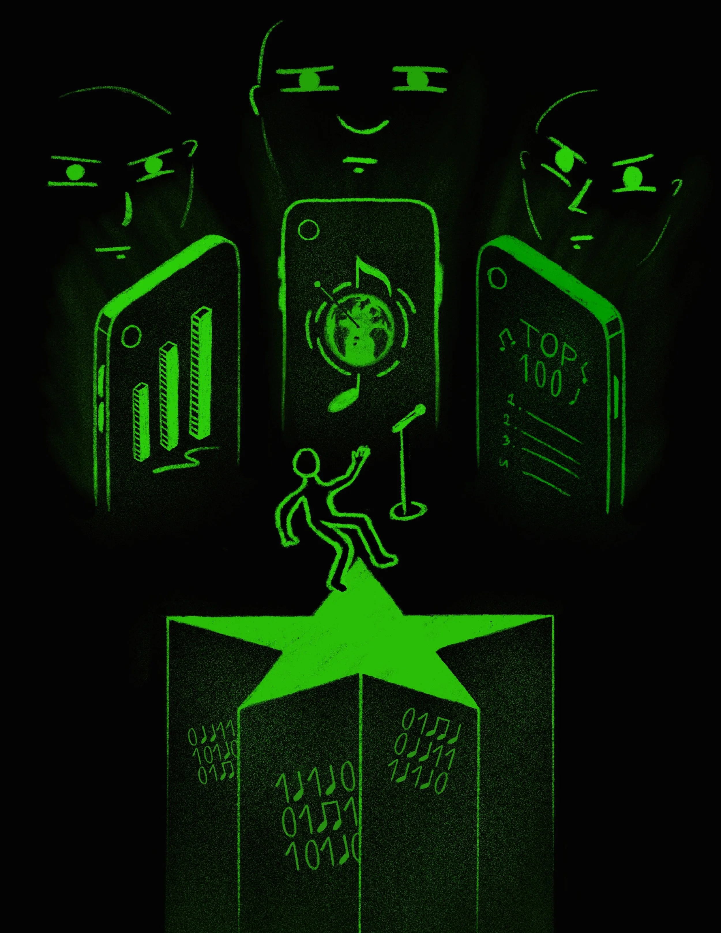
The Shazam Effect: Record companies are tracking download and search data to predict which new songs will be hits. This has been good for business—but is it bad for music?
Editorial illustration. Assigned during an OCAD Cont. Studies illustration course. Read the article it was taken from.
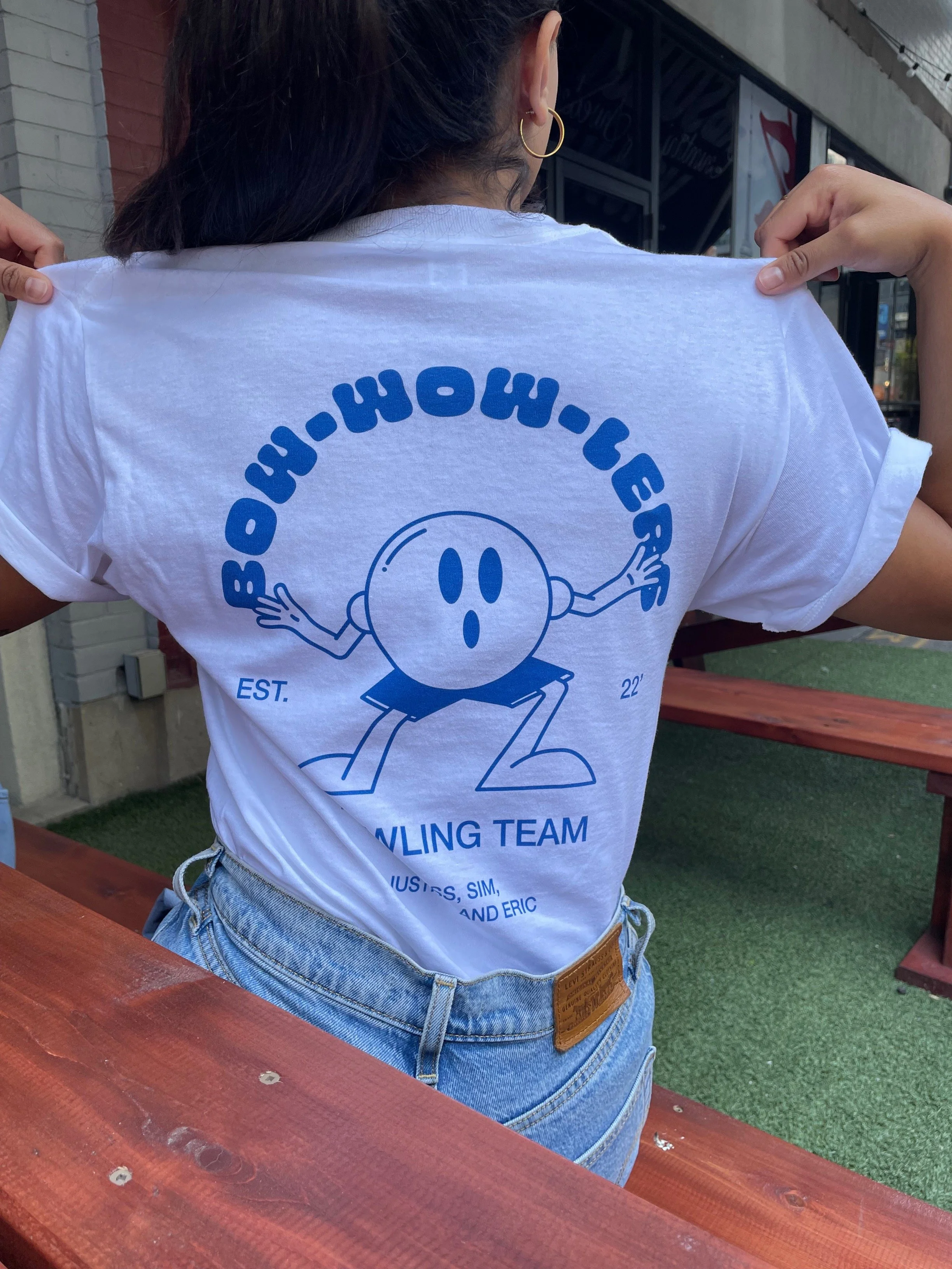
BOW-WOW-LERS
Designed for a Leo Burnett summer event party.
Brinner Drink Menus
Designed for an annual work event party hosted at Bar Modercai.
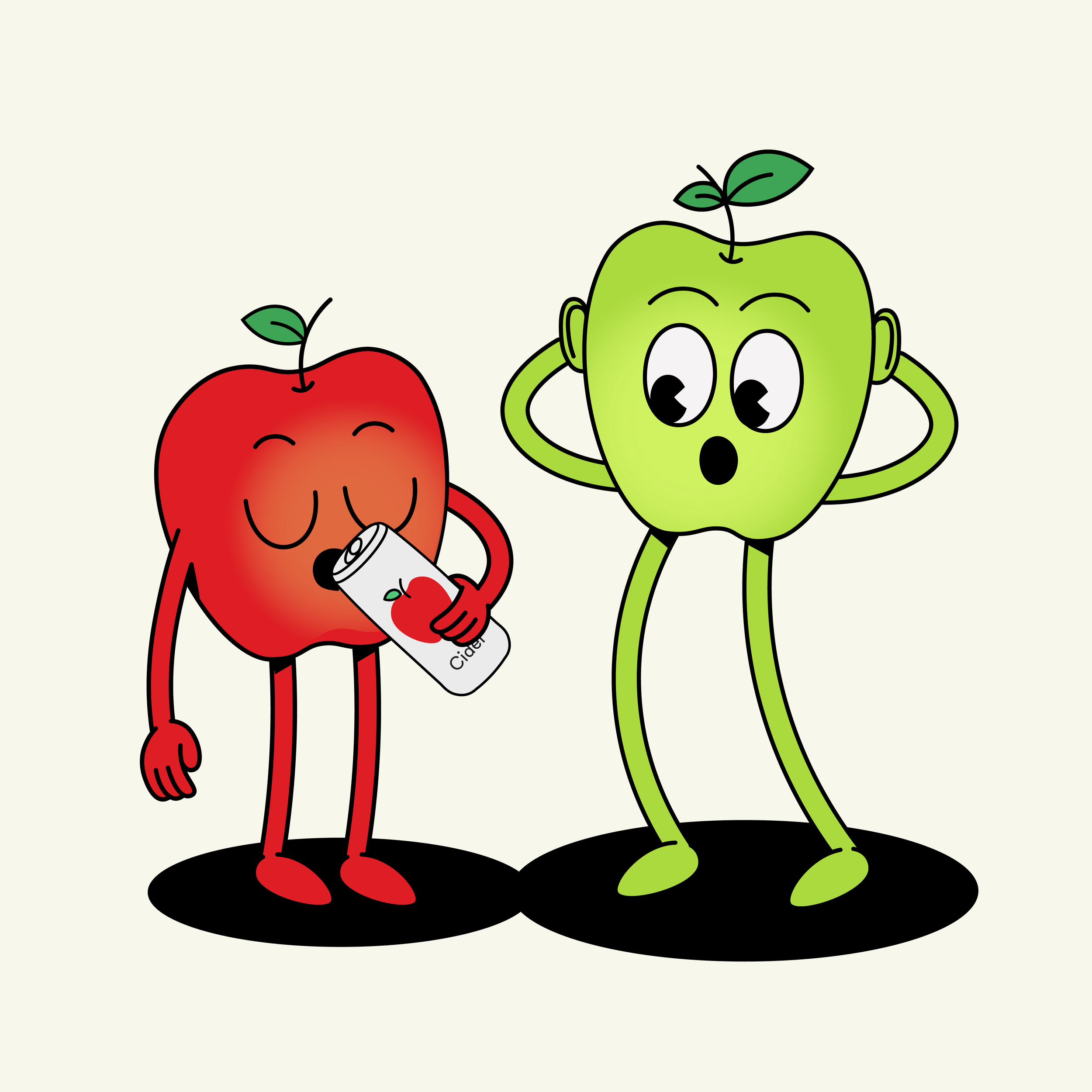
Cider Marketplace – Illustration Concept
At some point, I was so obsessed with ciders, that I thought about coming up with an app that would help you discover and track your favourite ciders. The app remains a WIP, yet I fell in love with the mascot.
Alternative Illustration
A an apple drinking cider?!


